Color-blocking

An Ecce Homo Guide

Over the course of Ecce Homo’s fashion blog, color has been a constant preoccupation and a point of reference for thinking about fashion, gender, and sexuality! We are a queer fashion brand with a wide color palette after all! We keep renewing and refreshing our existing collections, six underwear and one swimwear collections as a matter of fact, by offering older designs in brand-new, vibrant, and exciting colors. Lime yellow, silver, steel grey, glossy petrol, blueberry blue, magenta, carmine red, and signal blue, these are but a few of Ecce Homo’s carefully handpicked colors in unexpected shades and tones that are able to make your style both classic and à la mode at the same time along with black and white. In addition, our meticulous emphasis on color stems from our firm belief that, especially for queers all over the world, pieces of underwear and swimwear can be easily worn as outwear upgrading this way a look and offering both style and comfort. Even though many of our products are designed and presented as monochromatic sets, the truth is that the tops and the undies are sold separately giving you the chance to get creative and mix-match designs, fabrics, textures, and colors! But why is color so important? What are the basics of color theory? What is the so-called color-blocking that seems to be always in fashion? Are there any useful tips on how to create the perfect color-blocking look? Without further ado, let’s get into it!
As we elaborated on our three-part blog series on the history of blue and pink and their lingering gender connotations, color does matter! First of all, as an inextricable part of textile technology, a whole industry is dedicated to creating, manufacturing, and marketing new colors every year. This way color itself is a major parameter in trend forecasting! Just bring to mind the Color of the Year by the Pantone Color Institute proposed to be used for marketing, product creation, and rebranding. This ‘suggestion’ offered by Pantone, which is globally recognized as a leading source of color expertise, has enormous aesthetic and financial effects both on the fashion industry and on one’s wardrobe. Secondly, in every culture across the globe and throughout history, color bears an immense symbolic weight, because it is strongly associated with specific character traits, notions, feelings, images…and genders! Their symbolic and by extension financial value rests on the grids of association to which they belong and the magical power with which they are endowed of bringing into existence that which they signify in a complex yet powerful cognitive and psychological system of categorizing the world around us.
Thirdly, thinking in colors is inevitably 
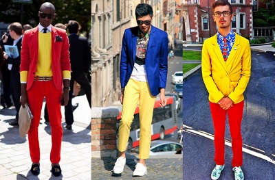
thinking in terms of gender and sexuality, and the history of sex-specific colors reveals the culturally specific and historical contingent ‘nature’ of the gender-coding of colors, and of gender and sexuality itself. The ‘pink for girls, blue for boys’ mantra in baby fashion industry is just one instance of this pervasive and multilayered phenomenon. Another example closer to home is 
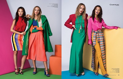
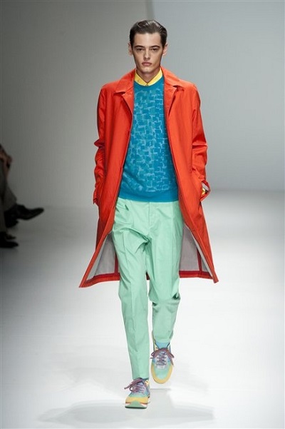
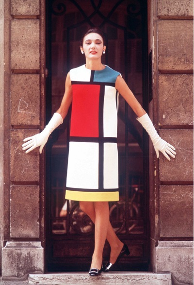
Ecce Homo’s brand-new swimwear collection titled RetroWaves where the connections and interplay between the two basic colors, the (signal) blue and the (carmine) red, capitalizes on and simultaneously subverts the socially and symbolically expected associations between color and gender. More specifically, these colored surfaces are interrupted by geometrical patterns, a reminder that any self-enclosed and pure identity bears the stain of its own subversion. However, this use of the word ‘color’ seems to be a bit naïve when color is seen through the perspective of color theory! In visual arts in general, 
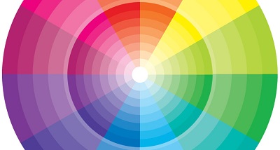
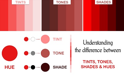
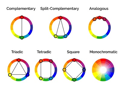
color theory stands for the science and art of using color, that is all those rules regarding color mixing, the visual effects of each color combination, the perception of color by the human eye, the symbolic messages each color sends off, etc. For the practical purpose of how to build a color blocking look, a few words on the so-called 
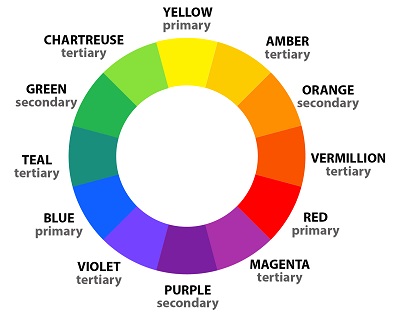
color wheel are more than enough to guide you through the very basics of color theory. Fun fact: the first ever color wheel was designed by Sir Isaac Newton in 1666!
Every color wheel consists of three categories of color based on relations of derivation: 

Primary colors: red / yellow / blue (these colors do not derive from any other color) 

Secondary colors: green / orange / purple (these colors derive from mixing primary colors) 

Tertiary colors: yellow-orange / red-purple / etc. (there colors derive from mixing primary and secondary colors)

Colors are also distinguished on the basis of their ‘temperature’

Warm colors: red / orange / yellow / etc. 

Cold colors: blue / green / purple / etc.

Regarding the properties of each specific color and its variations, hue refers to the dominant color family that consists of primary and secondary colors. Tint, shades and tones are variations of the basic hues: 

Hue + white = tint (e.g., red + white = pink) 

Hue + black = shade (e.g., red + black = burgundy) 

Hue + grey = tone (e.g., red + grey = crimson)

Color schemes refer to color combination by drawing imaginary schemas on the color wheel:

Complementary colors: colors found opposite to each other on the color wheel (e.g., orange and blue) 

Split-complementary colors: colors found opposite to each other on the color wheel except one of the complements is split into two nearby analogous colors (e.g., red, blue-green, and yellow-green) 

Analogous colors: colors found next to one another on the color wheel (e.g., red and orange) 

Triadic colors: colors found evenly spaced on the color wheel (e.g., purple, orange and blue)

This brings us to the task at hand: how to create the perfect color-blocking look! Color-blocking refers to the mixing of at least two -according to some fashion experts, of at least three- colors in the same outfit to create a colorful and eye-popping look. Here are some useful tips:

  • Go for color harmony, this visceral feeling of inner balance and order that is pleasing to the eye. To achieve this resort to the color schemas above, look for fashion images online, or study nature for inspiration! Take the color context into consideration. 
  • Pay attention to the relations among colors, especially their shape, the area they cover and the material/fabric on which they are. For example, the same color gives off a different effect depending on the background color. 

  • Choose a combination of colors that looks good on your unique skin, makes you feel good and passes across the right message for you. Your skin undertone plays a major role here. 

  • Avoid prints and patterns and prefer monochromatic pieces. 

  • Wearing several shades, tints, or tones of the same color,  is always a safe option. 

  • Choose ‘quite’ and color-less accessories, nail polishes and jewelry. 

  • Remember that more than three colors are hard to harmonize. 

  • Don’t forget that shoes have a color and they are one of the first things that one notices on a person. 

  • Don’t get away with neutrals, like black and white, as they can balance a ‘loud’ look, create a figure, or even accentuate a color effect.

Perhaps the most amazing and iconic example of color-blocking can be found in Yves Saint Laurent’s fashion collection for the Fall/Winter Collection of 1965-1966 which explicitly draws from the avant-garde art movement and theory called Neo-Plasticism that arose in 1917 and was put into artistic practice mainly by the De Stijl artists, most famous among them the Dutch painter Piet Mondrian.


WinBank
Login-iconLogin