pink and blue

Why does color matter?

Our latest four-part blog series titled The Story of Underwear has definitely proved itself to be one of the most popular across Ecce Homo’s blog. It seems that undergarments have quite a story to tell, one full of surprising continuities and unexpected twists that follows the ebb and flow of humanity itself. Most importantly, this journey throughout the clothing history of Europe and the USA, from the dawn of civilization all the way to the second half of the 20th century, provides us with a unique lesson on the historical and cultural relativism of clothing and ultimately of gender and sexuality themselves. More specifically, looking back at undergarments from different historical eras helps us understand how relative our current gender and sexual assumptions are across time and space, how contingent the meanings different historical periods assign to these two notions are.

Make no mistake though; taking a grasp of the historically situated and culturally specific construction of gender and sexuality does not automatically mean that these two organizing principles of our societies and lives are less ‘real’ somehow. On the contrary, no matter how changing and variable the gender and sexual perceptions are, these continue to have a strong hold on our ways of longing and belonging, on our self-understanding, and on establishing and maintaining power relations. In other words, the constructed -rather than the essential, timeless, and asocial ‘nature’ of gender and sexuality- helps us denaturalize our taken-for-granted heteronormative social arrangement and reimagine another future. Within and against the heterosexist historical and social determinations, there is the glimmering hope that things could be otherwise, and that we can reinvent ourselves and challenge our current predicament.

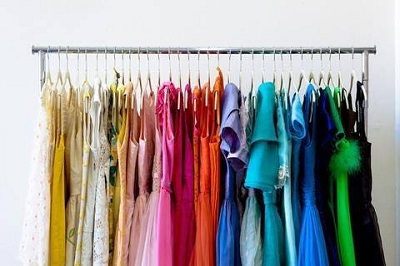
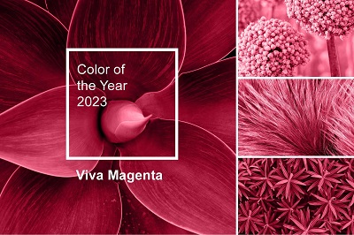
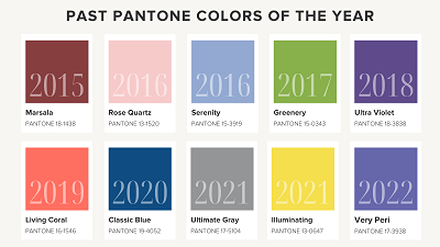
This lesson learned from tracing the story of underwear is an invaluable one on which I would like to further elaborate from another -yet closely related- perspective with this new three-part series on the color! As you can imagine, the story of clothing is inextricably linked to the story of color. Along with textile technology, a whole industry is dedicated to creating, manufacturing, and marketing new colors every year. Just bring to mind the Color of the Year by the Pantone Color Institute proposed to be used for marketing, product creation, and rebranding. This ‘suggestion’ offered by Pantone, which is globally recognized as a leading source of color expertise, has enormous aesthetic and financial effects both on the fashion industry and on one’s wardrobe.

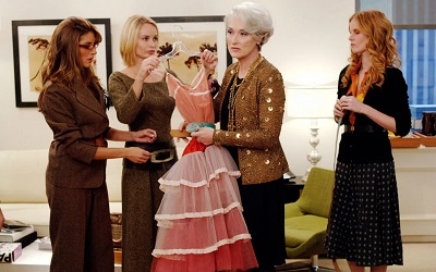
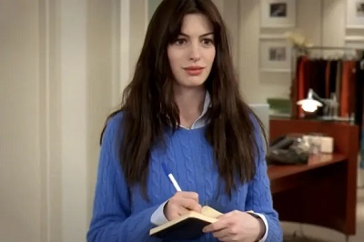
Beyond the fashionsphere, every year this particular color seems to be everywhere, from cars to furniture, from walls to jewelry, from artworks to marketing campaigns, giving the impression that we live in a monocolored culture, provoking a chain reaction that suddenly takes our visual globalized field by storm. Setting each year’s color trend affects the decisions of thousands of designers all over the world who strive to increase their customer reach and their relevance in a changing -at the speed of the light- fashion landscape. This inevitably translates to a fast-fashion production model, where the clothes dyed in the color of the previous year are considered out of fashion and as such dispensable. The Devil Wears Prada (2006) famous cerulean sweater monologue by the character of Miranda Priestly, reminiscent of Anna Wintour, the Vogue editor and fashion mogul, is telling in this regard:

You… go to your closet, and you select… I don’t know, that lumpy blue sweater for instance, because you’re trying to tell the world that you take yourself too seriously to care about what you put on your back, but what you don’t know is that that sweater is not just blue, it’s not turquoise, it’s not lapis, it’s actually cerulean. You’re also blithely unaware of the fact that, in 2002, Oscar de la Renta did a collection of cerulean gowns, and then I think it was Yves Saint Laurent, wasn’t it… who showed cerulean military jackets…And then cerulean quickly showed up in the collections of eight different designers. Then it filtered down through the department stores, and then trickled on down into some tragic casual corner where you, no doubt, fished it out of some clearance bin. However, that blue represents millions of dollars of countless jobs, and it’s sort of comical how you think that you’ve made a choice that exempts you from the fashion industry, when in fact, you’re wearing a sweater that was selected for you by the people in this room… from a pile of ‘stuff.’

Putting the sheer elitism and classism aside, this passage illustrates the immense importance of color as both an aesthetic and a financial value, how color permeates the fashion industry, how the choice of our ‘favorite’ color creates an illusion of individualized style carefully crafted to transmit a specific message as the ‘dress for success’ phrase testifies. And this is the key point: a handful of ‘color experts in a room’ declare a color the color of the year and a few months later we as consumers make a more or less unconscious buying choice based on their decision not only totally ignorant of this fact but also believing that this color choice expresses our innermost self, our aesthetic, our uniqueness. But there is more to it than this. Why does picking a pair of leggings or a bralette in this or that color give us the illusion of personal expression, to begin with? Why is color so powerful? Why do we talk about color forecasts and why do so many brands put so much effort into their color profile? One answer would be the following: color bears an immense symbolic weight, because it is culturally and historically associated with specific character traits, notions, feelings, images, etc. Let us take a closer look at the 2023 Color of the Year, that is Viva Magenta, and how it is described on Pantone’s official website:

Pantone’s Color of the Year, Viva Magenta 18-1750, vibrates with vim and vigor. It is a shade rooted in nature descending from the red family and expressive of a new signal of strength. Viva Magenta is brave and fearless, and a pulsating color whose exuberance promotes a joyous and optimistic celebration, writing a new narrative. This year’s Color of the Year is powerful and empowering. It is a new animated red that revels in pure joy, encouraging experimentation and self-expression without restraint, an electrifying, and a boundaryless shade that is manifesting as a stand-out statement. PANTONE 18-1750 Viva Magenta welcomes anyone and everyone with the same verve for life and rebellious spirit. It is a color that is audacious, full of wit and inclusive of all.
What we have here is a powerful ideological mechanism in black and white, or in magenta if you prefer! Viva Magenta is described as brave and fearless, powerful, and empowering, it evokes feelings of joy and optimism, it is associated with notions such as self-expression and experimentation. It is a color that not only signifies an array of things, but has also the ability to do things. In other words, it is endowed with a performative capacity as it is able to be empowering and encourage certain attitudes. On top of that, it is a stand-out statement all by itself, by its mere presence! According to this rationale, wearing a viva magenta t-shirt can urge you to do and feel a certain way, rather than expressing an attitude already there. And that’s the starting point for our next article in which we will tackle the following question: how has color come to signify specific genders? Why blue for boys and pink for girls?  


WinBank
Login-iconLogin